Singapore National Youth Chinese Orchestra (SNYCO)
The SNYCO logo is a blend of tradition and innovation, reflecting the orchestra’s vibrant spirit and its connection to the Singapore Chinese Orchestra (SCO).
The logo retains the SCO wordmark, ensuring brand recognition and continuity. The prominent ‘Y’ with a loose, strong brushstroke symbolizes vibrancy, youthfulness, and fun, capturing the dynamic energy of the young musicians. This element embodies SNYCO’s mission to inspire, nurture, and develop youth into exemplary music advocates serving the community.
Bright, neon colors replace SCO’s traditional red and black, presenting SNYCO as a contemporary, youthful brand. These colors evoke excitement and inspiration, central to the orchestra’s identity and its vision to be recognized for artistic excellence and rich Singapore heritage, both locally and internationally.
The circular form hints at unity and togetherness, suggesting members holding hands in harmony, aligning with SNYCO’s mission and values. This design represents a sincere attitude towards music making, nurturing resilience, yearning for creativity, and compassion for the diversity of life. It also signifies optimizing full potential towards excellent performance, reflecting the orchestra’s core values.
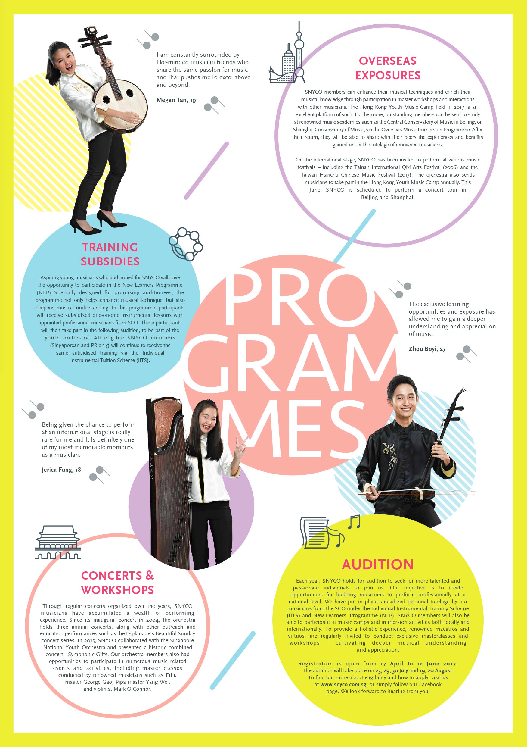
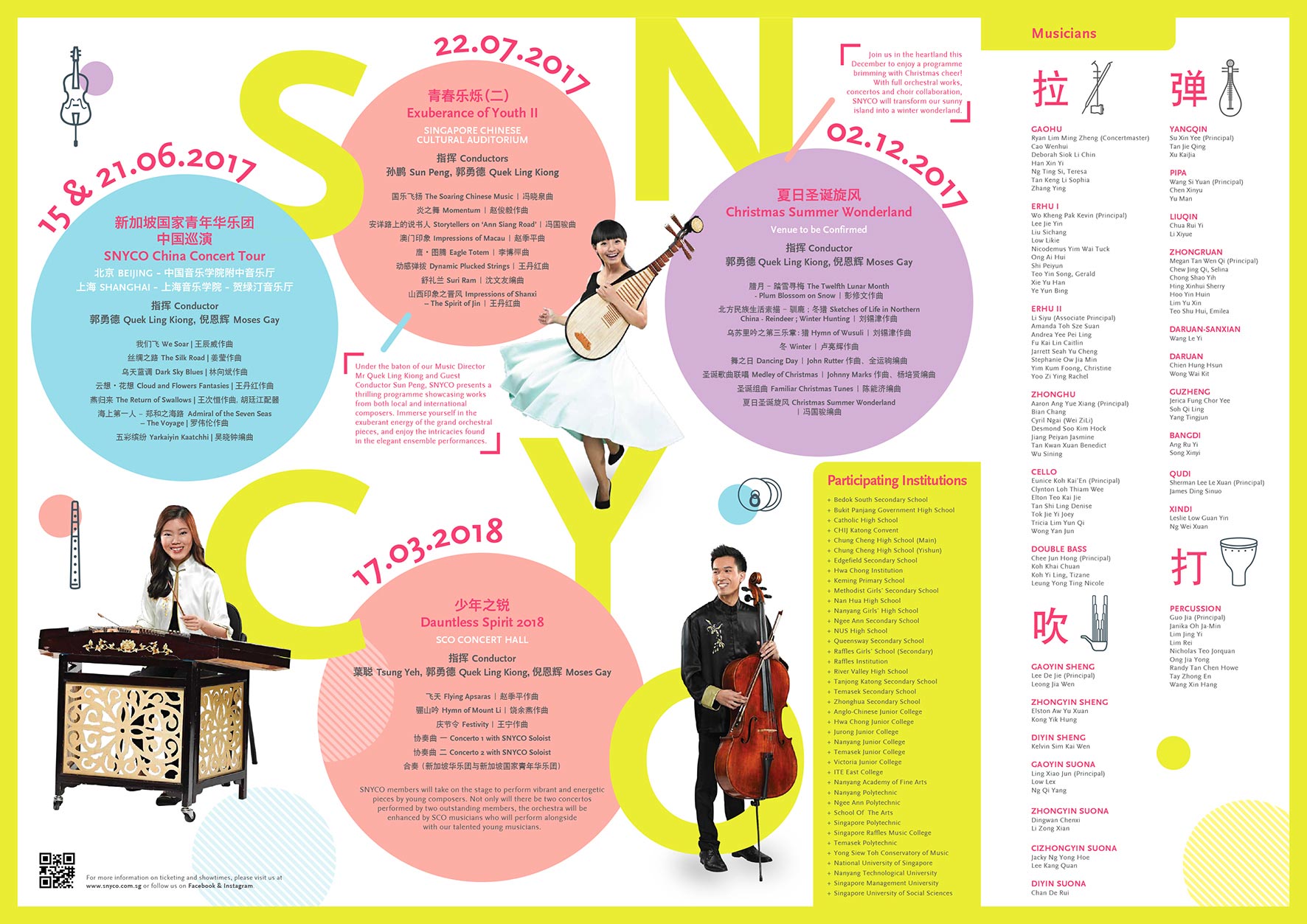
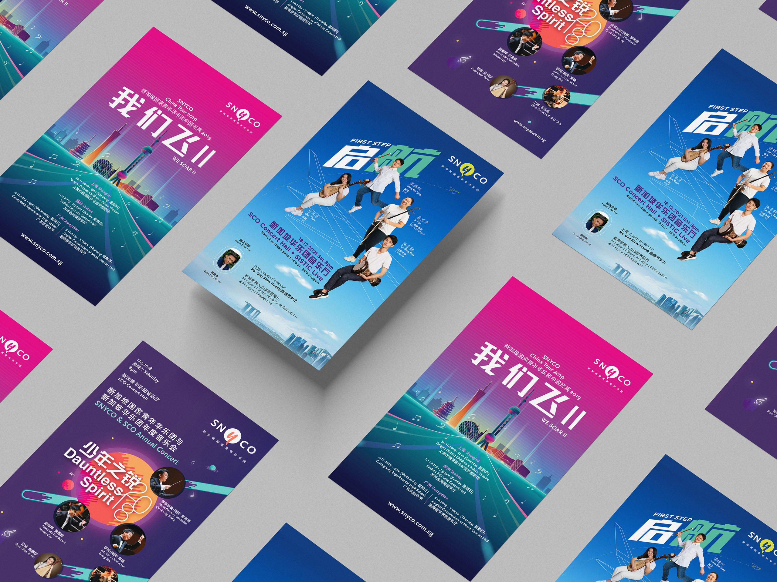
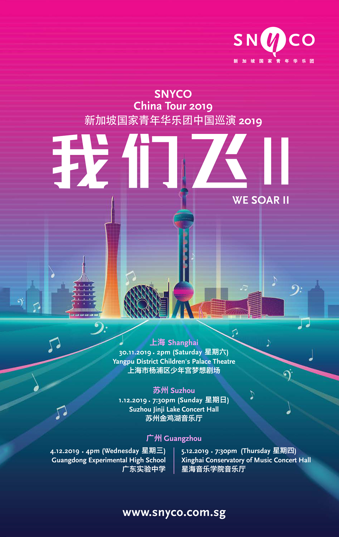
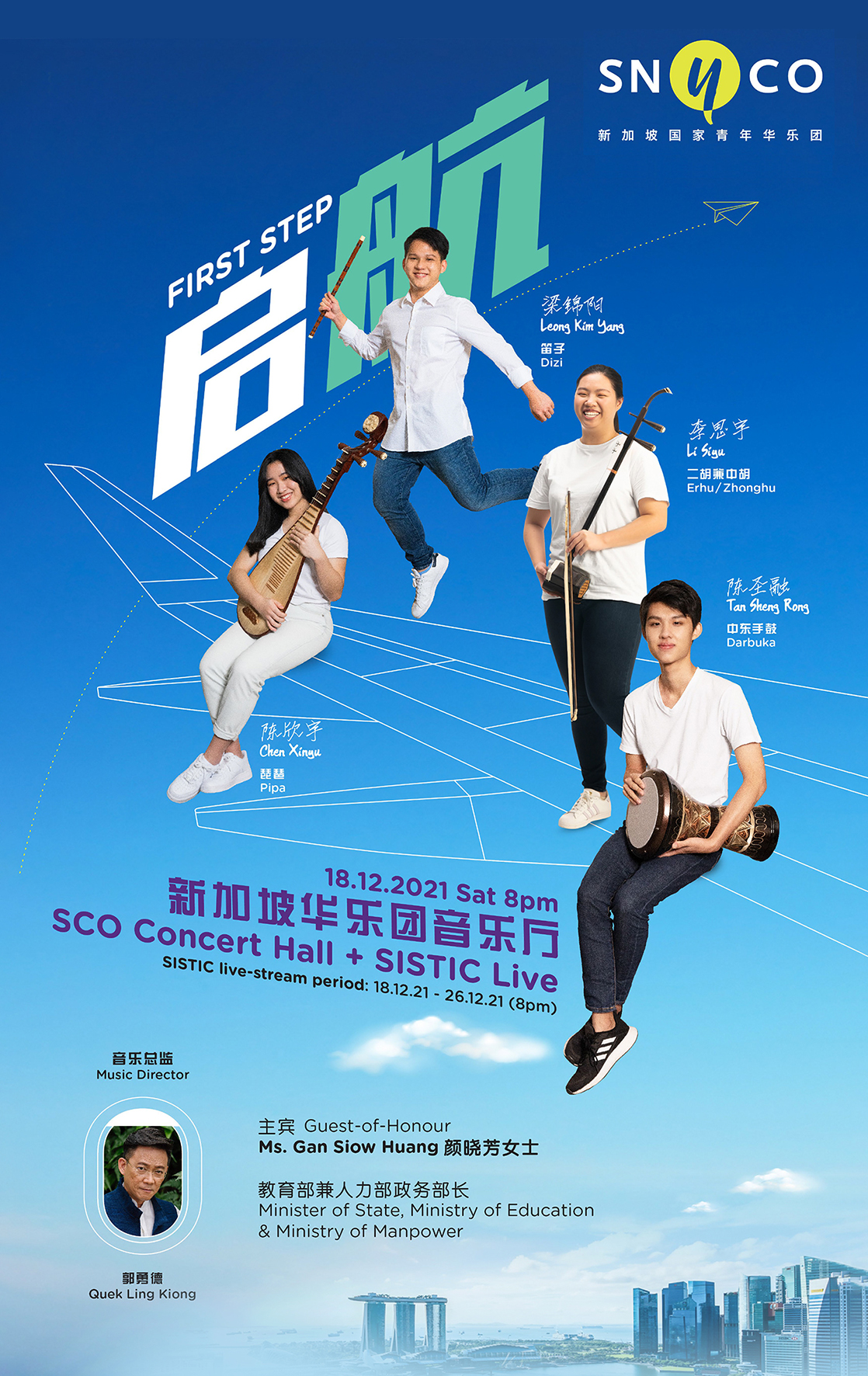
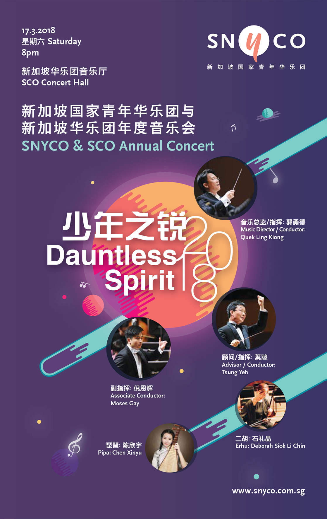
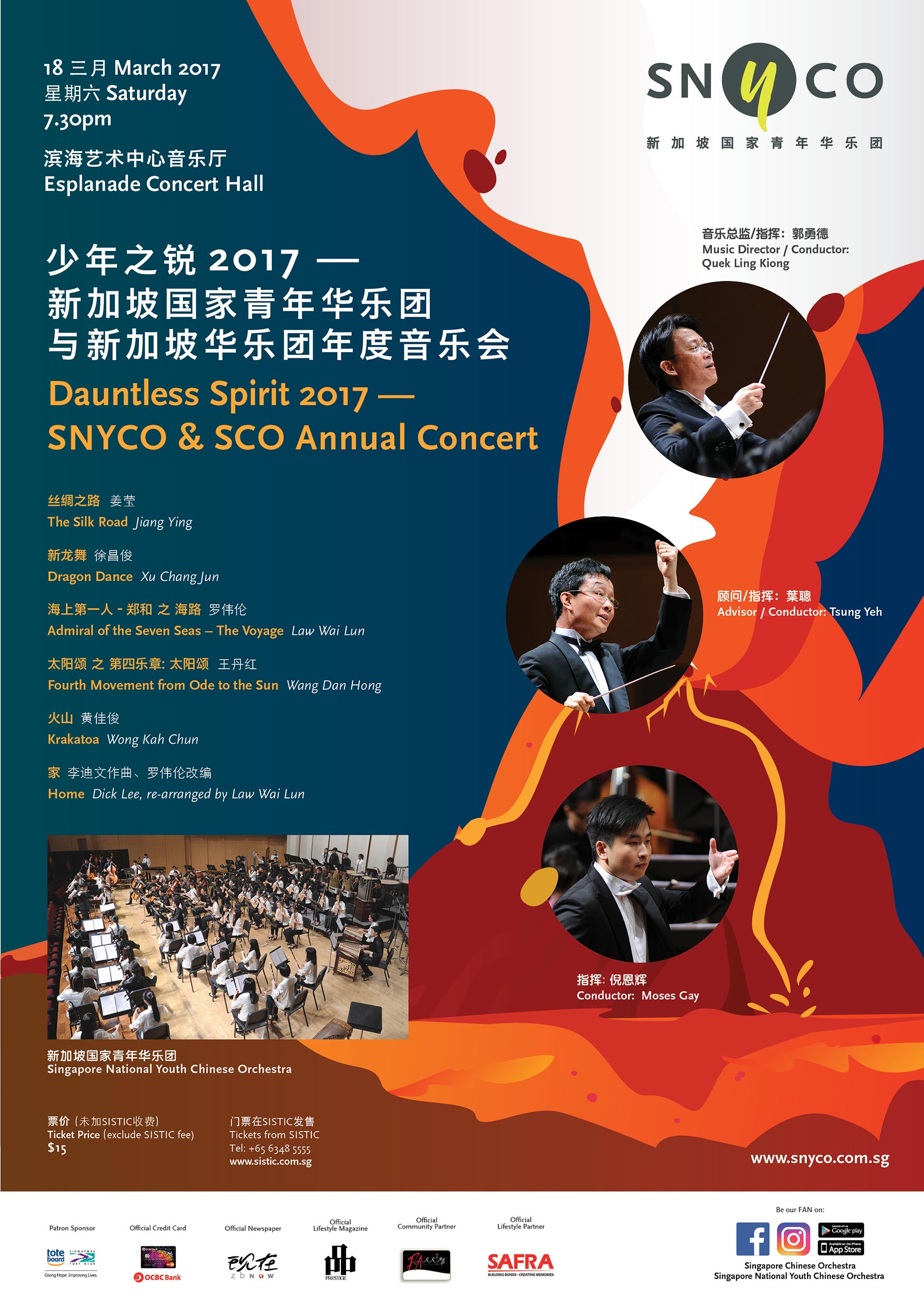
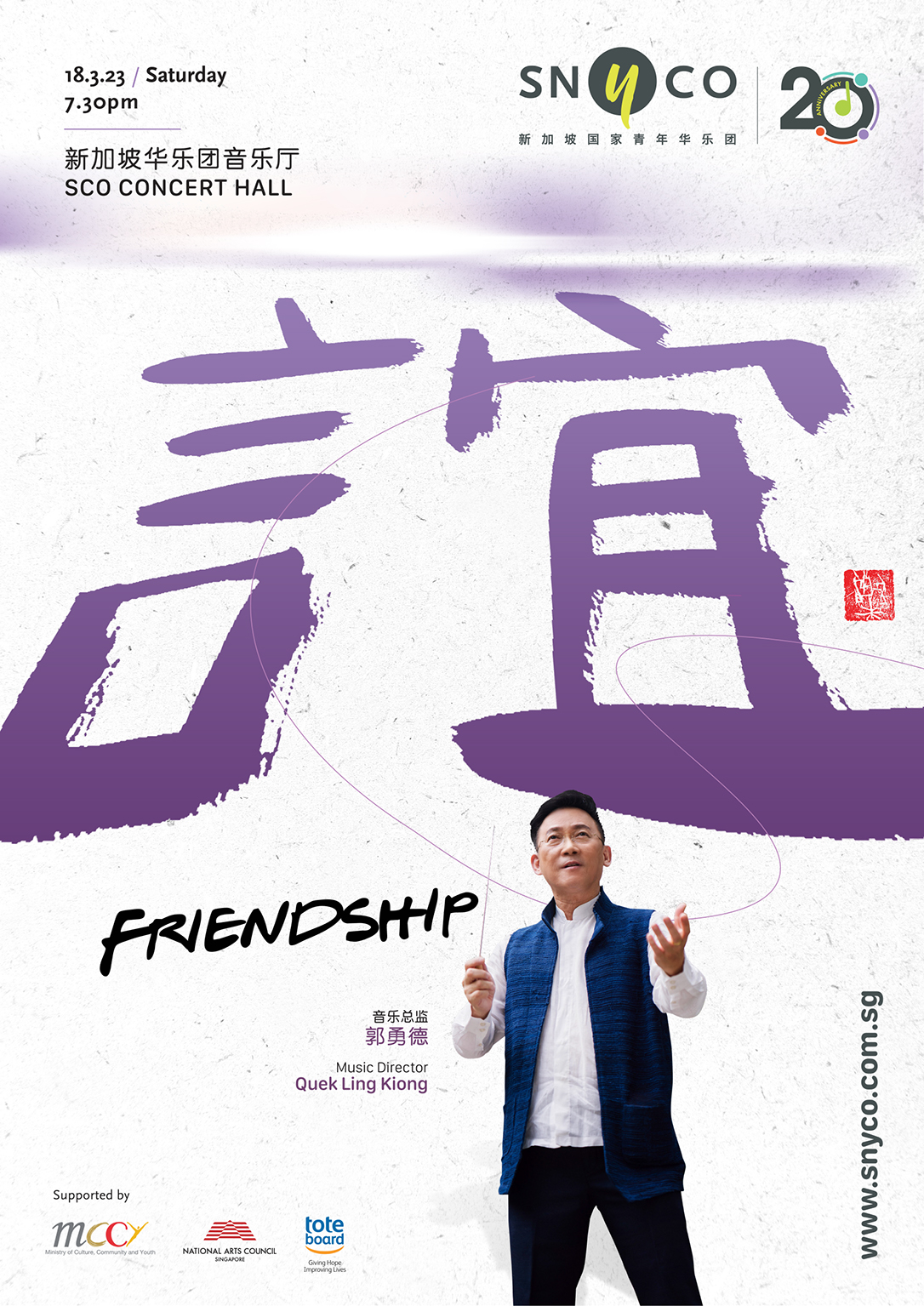
Projects
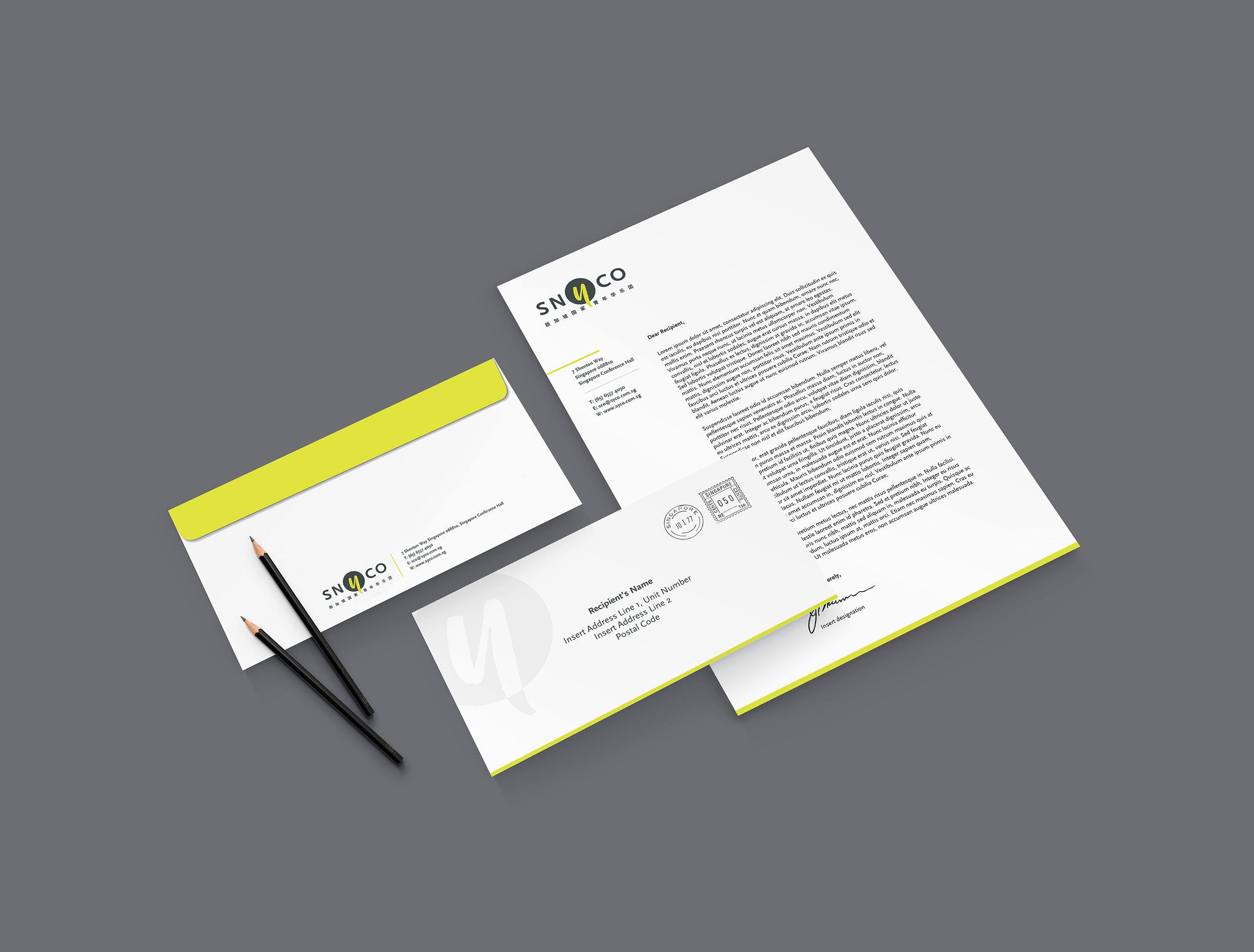
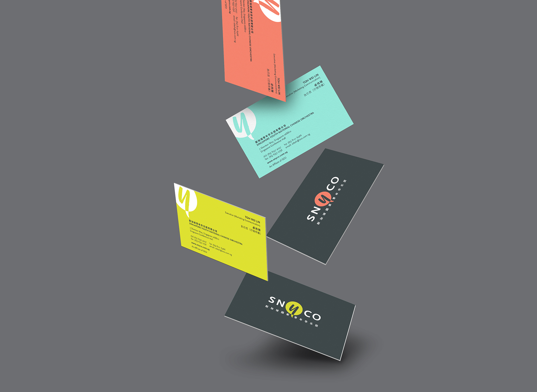
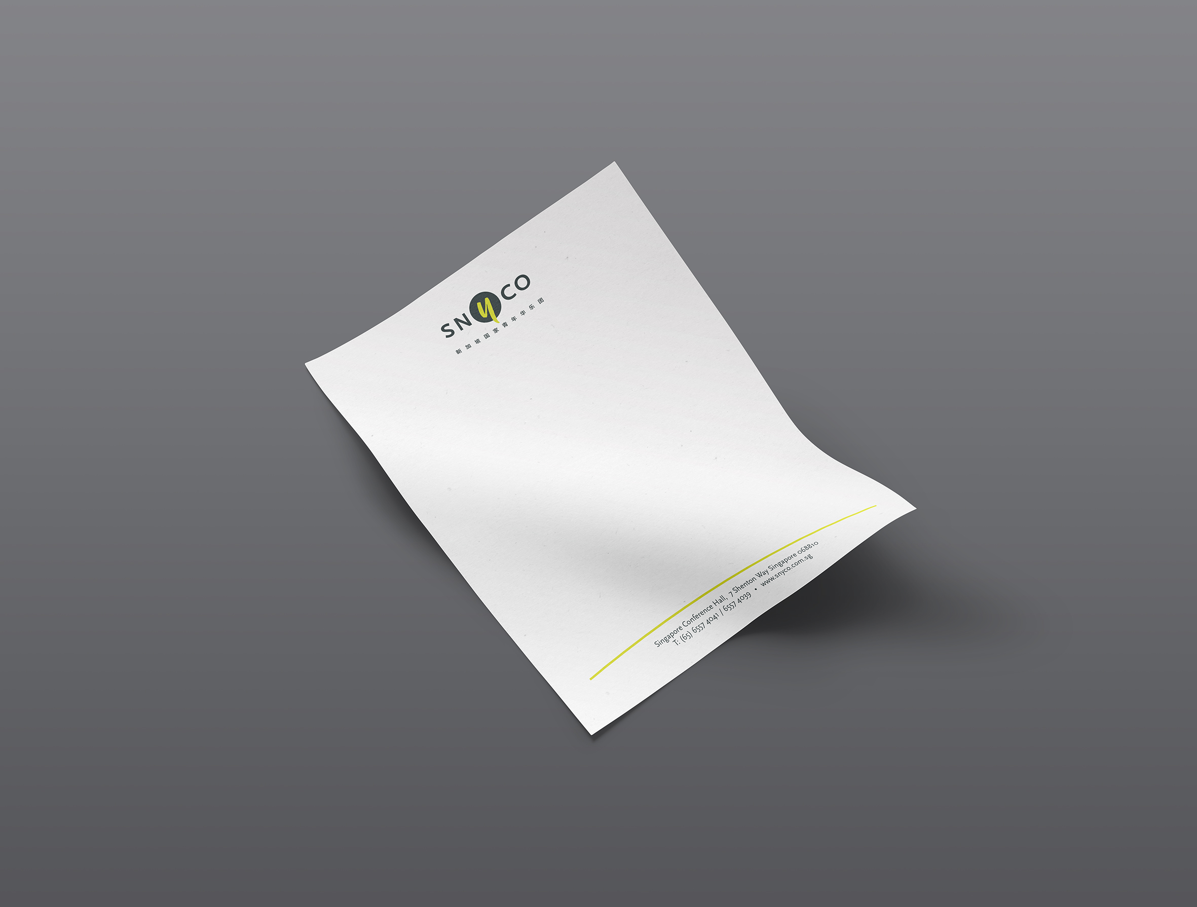
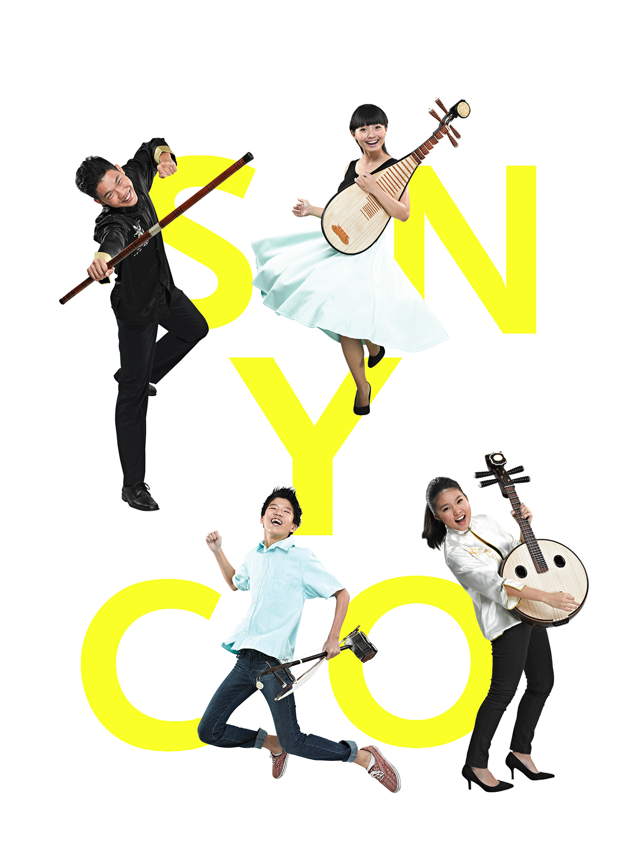
SNYCO Logo · Anniversary Logo · Stationary · Brochure · Posters · Social Media Banners
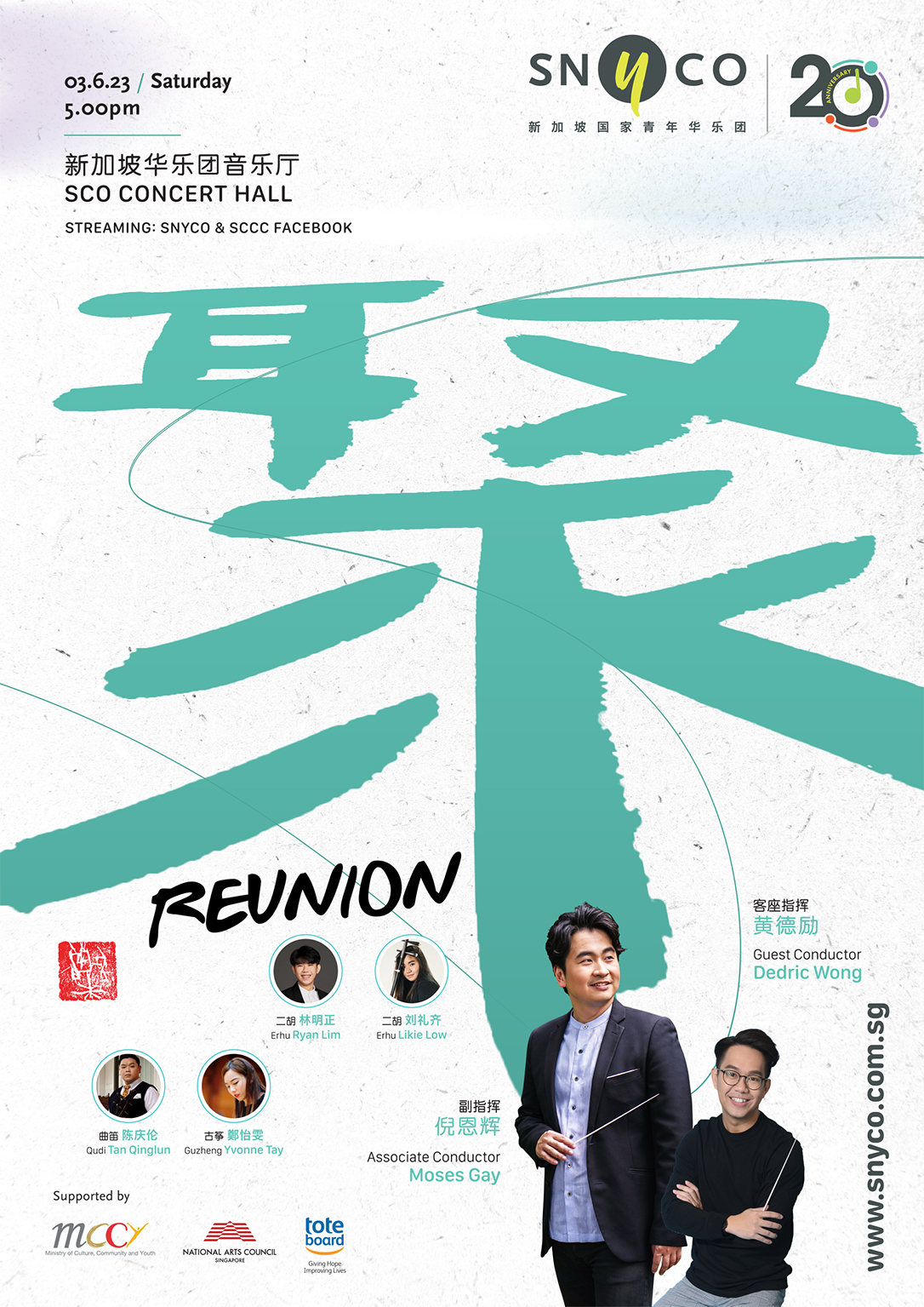
SNYCO 20th Anniversary Logo To celebrate SNYCO’s 20th anniversary, the logo was thoughtfully revamped to symbolize optimism and youth. Inspired by the idea of “reunion,” the abstract design is based on the number “0” and represents youth members holding hands in unity, reflecting the theme of the upcoming “Reunion” concert on June 3rd. It also signifies the collective goal of “Together, SNYCO can reach new heights.”
The diverse corporate colors in the logo portray vibrant, youthful energy, bringing excitement and inspiration.